Excellent message and design. Easy to install.
Dec 29, 2020

Wondering how our blues look in person? Wonder no longer- read this blog or order FREE color samples on our site!
|
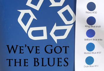
After receiving a lot of positive feedback from the “Description of our Reds” blog, we decided to go ahead and do each color group & the next group of colors we would like to focus on is the blues. This group is significantly larger than our red group and, oddly enough, is a hard color group to find an “everyday item” for. The objects we decided to use for comparison are an average recycling bin and my manager’s 2010, atomic blue,Honda Civic. If you’re wondering what color blue that is, I like to refer to it as “Prius Blue” –let’s be honest, much to your dismay, you see these cars EVERYWHERE. In fact, you probably got cut off in traffic by one on your way home from work yesterday- and it could've been my manager! All jokes aside, here is the comparison using the recycling bin!
The comparison with the atomic blue Honda civic…
As I mentioned in the reds blog, variations between my interpretation of the colors and the way you perceive them are often prominent due to different screen resolutions. In this comparison, an element that definitely got in our way was the lighting. For example, powder blue #172 appears to be an off-white color with a blue tint when out in the sun, but when indoors, is perceived as a light, almost gray, blue. With that being said, my main goal is to convey exactly how the blues vary from each other and focus on how tricky they can be on our color chart. I will begin by saying that Navy #50 is our darkest blue and power blue #172, our lightest. The colors go down from darkest to lightest as shown in the photos but there are a few key colors to pay attention to. Brilliant Blue #86 is a very tricky blue. This guy has a bit of a violet tint to his bright, yet dark blue color, making it truly “brilliant”! Muted Blue #57 and Dusk Blue #51 are often confused as being the same color, but Dusk Blue is a little bit darker. The last blue that always tricks people in our previews is Geyser Blue #173. Although it is hard to tell, if you look closely at the recycling bin photos, #173 is actually a little brighter than Ice Blue #56. This color really “pops” when compared to the neighboring blues. As a reminder we do offer FREE color samples all day every day... absolutely no cost, it only takes a bit of time. We send them out on a postcard in the regular mail- this is the perfect way to see the colors in person and really decide for yourself! I hope this helped you in your quest to find the perfect shade of blue. In the event that you have questions about ANYTHING- color, size, installation, give us a call. In order to achieve supreme customer service, we take phone calls from 10am-5pm eastern time, Monday-Friday at 800-615-6473. If talking on the phone isn’t your thing, you can send questions to our live chat operator between the hours of 10am-5pm or an email to info@tradingphrases.com and one of us will respond within 24 hours. |